The World Expo is a bi-annual event that showcases the best each country has to offer in terms of culture and technology. Each participating country has the chance to put its best foot forward and show the rest of the international community its proudest achievements. It’s an architectural smorgasbord too, with each country housing its display inside a specially designed structure that’s part of the overall presentation.
If one were to summarize the spirit and flavor of a nation at a glance, this is the perfect opportunity to show the rest of the world what image each country is trying to project. Some succeed, some do a lukewarm performance, and an unfortunate few fall flat at the task.
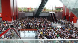
Its a rather curious social barometer too, with popularity being measured in how long people were willing to wait in line to get in. The longer the queues, the more prestige and interest generated for that host country. If you’re hosting a particularly impressive show, people will line up as long as 4-6 hours (and that’s on a slow day) just to get a glimpse of what you have up your sleeve.
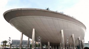
The 5 hour long queue to get inside Saudi Arabia's famed Space-ark themed Pavilion
.
The seemingly endless queue at the China Pavilion
(approx waiting time:4 hours)
.
Some try to highlight their culture and rich history, some going as far as bringing in original pieces of high profile artwork like what France, Italy and Mexico did. Some went for the technological prowess angle like Japan, South Korea and Saudi Arabia (who spent close to USD 0.2 Billion to build their cutting-edge pavilion which houses the world’s largest IMAX theater). For first world countries, it was a chance to show-off; for countries not so fortunate, it was still an opportunity to gain some PR points and perhaps generate interest to boost their tourism.
There’s a lot at stake in this year’s World Expo as the host country China went all-out (like they did with the Olympics) with the logistics. With over 5.28 square kilometers (just traversing the breadth of the Expo grounds is already akin to running a marathon) and more than 200 participating countries, this is the largest, most expensive, and comprehensive world showcase ever. One would have to spend 2 whole weeks from opening time at 9AM till 12MN at a minimum if you plan to see everything the fairgrounds has to offer.
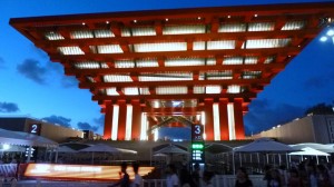
The towering China Pavilion - a gigantic reverse pyramid with a Chinese red lantern theme .UK Pavilion .
France Pavilion
.
Italy Pavilion
.
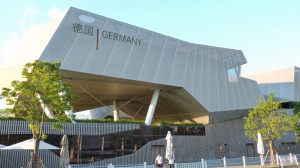
Germany Pavilion
.
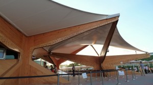
Norway Pavilion
.
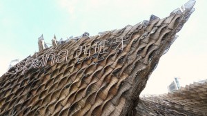
Spain Pavilion .
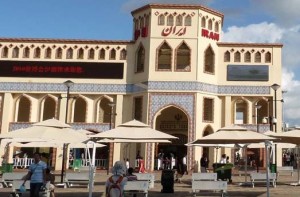
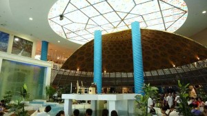
I’ll leave the architectural critiques to the more specialized websites in the Internet and jump straight on the social implications of some of the country’s offerings. If you had 10 minutes to describe to a total stranger what your country is all about, that should be answered in the way you designed your overall presentation. The pavilion’s architecture should express your cultural heritage and artistic expression. What you choose to put on display tells a lot about your country. What is it most proud of? What does it want the rest of the world to think of it? What image is it trying to project? These are some of the important questions that need to be answered when designing a well-made presentation.Needless to say, religion plays a big part in the overall presentation of some countries. Iran in particular, designed its pavilion with a mosque-inspired architecture.
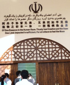
Above the doorway’s threshold : “One limb impacted is sufficient for others to feel the mace”. Not the most welcoming of messages to greet visitors with. Some might even detect the hint of a threat implied, which led me to wonder at first why this particular passage was chosen.
I later googled up the passage which turned out to be a poem from the 12th century Persian (Iran in ancient times) poet Saadi.
Of One Essence is the Human Race,
Thusly has Creation put the Base.
One Limb impacted is sufficient,
For all Others to feel the Mace.
The Unconcern’d with Others’ Plight,
Are but Brutes with Human Face.
It’s a quotation often used as an Islamic call towards world unity, thus the “one human race”. It’s supposed to be interpreted as “if one person is hurt, others would empathize with the pain thus our humanity is based on compassion for the welfare of all.”
[*whew* for a minute there, I thought it meant that you only had to whack one person’s limbs with a mace to scare everyone else into submission]
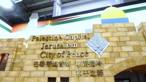
Palestine came up with a rather “hopeful” display, declaring itself a “city of peace” with the symbols of both Christianity and Islam prominently displayed in the background.
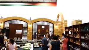
Before leaving the building, you can stop by their gift shop, stocked with all manner of religious icons and knick-knacks from crucifixes to rosaries, strangely no Islamic-themed trinkets are available which does present something of a detraction from the over-all theme of “religious equality”.
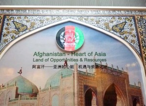
Afghanistan brands itself as the “heart of Asia” (probably after suffering a stroke and having to require a triple-bypass…). A “land of opportunities and resources” too… though as to what “opportunities and resources” in particular, I’ll leave that to your imagination.
Mongolia’s pavilion is closed (I am not kidding). A black cloth shrouds the glass doors and all the windows so you can’t even sneak a peek inside. There’s a note on the door that this exhibit is closed until further notice. One can’t help but speculate if the strained relationship with China had anything to do with it.
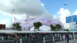
Fortunately, Japan didn’t suffer the same fate. Despite its rocky relationship with China, its pavilion [if you’re wondering what the heck it’s suppose to be, it’s a gigantic anime silkworm made of high-tech space-age fibers] is still going strong and quite popular with the locals too (the queue is 4 hours long). Thus, the great irony embodied – the eternal love-hate relationship of China and Japan that started all the way back in the 1930’s with the invasion of Manchuria then followed up by the Rape of Nanking … an unforgivable crime in the eyes of many Chinese up until the present day. Even today, the hatred burns deep and any diplomatic ties between the two super-powers are perched precariously on a needle’s edge. So it’s unsurprising that one would read headlines in the papers that mention of such animosity. Just this week, China revoked entry of a thousand Japanese schoolkids and popular Japanese rock band into the Expo following yet another territorial dispute. Some call it patriotic extremism, some call it justified retaliation… though I suppose some Filipinos could relate, seeing as there are still a few here who still harbor resentment towards the Japanese for similar war atrocities committed well over a generation ago.
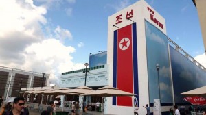
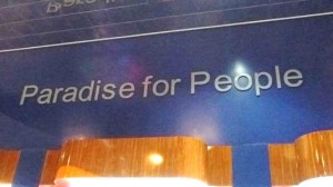
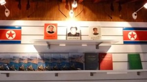
And then we come across another oddity… North Korea has also decided to participate. Flashbacks of watching Angelina Jolie in “Salt” came to mind and we wondered if we would be able to get out in one piece if we tried to sneak a peek inside.
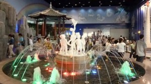
But lo and behold, nothing would prepare us for what lies inside. It simply defies explanation. Inside, visitors are greeted with rainbows, and murals of dancing oriental fairies, colorful fountains with statues children frolicking with doves of peace…
The sign says it all…
But before you go, do stop by the gift shop and grab a copy of Kim Jong Il’s bestsellers (quick, take a guess why they hit the all-time bestsellers list in its home country)
But not all the pavilions were as cringe-inducing as those. Some countries did pull off rather tasteful and creative ways of integrating its religious traditions into the overall design.
Saudi Arabia’s state-of-the-art “space-ark” features a wrap-around LED marquee that flashes different messages throughout the day, among them a lunar countdown of the different moon phases during the season of Ramadan.
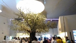
With Greece’s recent declaration of bankruptcy, it would be understandable that it would experience budget constraints in its presentation. But what it lacks in resources, it still managed to think up creative ways to showcase its rich cultural heritage. It highlighted its role a major port hub in the Agean Sea and designed its whole display area as a huge indoor maze probably as a nod to the story of Theseus entering the minotaur’s labyrinth. Each dead end leads you to an audio-visual room showing various facets of city life in a typical Greek “polis” or city. When you find your way out of the maze, you end up in the Garden of Hesperides with the iconic mythic tree that bears the golden apples. Guests can dine under the Tree of Hesperides and choose from a wide variety popular Greek cuisine.
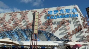
Kazakhstan, eager to rehabilitate its international image as a modern, thriving, and bustling metropolis after its unfortunate encounter with Borat, did an impressive job in convincing visitors that it has indeed come on its own into the 21st-century. It shows the country as a clean, orderly, and technologically updated young nation proud of its cultural heritage (funny hats and all).
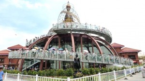
Nepal designed a twisting helix going up and around its pavilion to the shrine on top that holds the All-Seeing Eye. A nod to the pilgrimage devotees undertake going up Nepal’s Himalayan Mountains. Not up for climbing the peaks of mount Everest? Then take this fast-track tour.
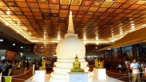
Sri-Lanka had an elegant Buddhist-themed display complete with an abstract gold-leaf Bodhi tree (the tree the Buddha meditated under). Watch native craftsmen creating intricate works of art in gold, silk and other local materials while sipping hot Ceylon tea.
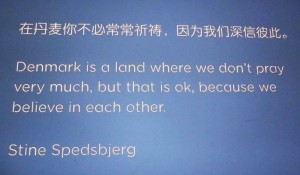
But atheists need not feel left out. Denmark is high and proud of its non-belief as the sign staunchly proclaims. Aside from giving us Lego, the Little Mermaid, and Carlsberg beer, all of which were also prominently displayed in their showcase, Denmark is proud to be predominantly atheist. A refreshing sight, to say the least, that a nation wouldn’t hesitate to tell the rest of the world that yes, there are places where prayers aren’t de rigeur.
It’s not a statement meant to flaunt atheism nor denigrate other countries who are religious, it is merely a statement of fact. Short, simple, and honest. So its good to know that at least one country is paving the way for secularism in the international arena. It’s a hard road ahead but I think the Danes are up for the challenge. Remember all the hot water that Danish newspapers got itself into for publishing cartoons of Muhammad? Well Stine wasn’t that infamous cartoonist but apparently, he draws too.
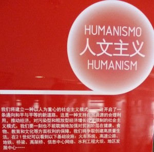
Venezuela may be better known for its winning streak in the Miss Universe, but one of the central themes in its presentation is Humanism.
Rough translation (oh my aching Chinese reading skills…) : we are building a social model centered on people focusing on peace and equality. It is based on the rational use of natural resources while balancing population growth and pollution. Keeping in mind the needs of even the poor to health, food, education, and culture. Quality of life through 21st century infrastructure like roads, bridges…
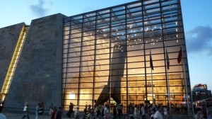
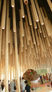
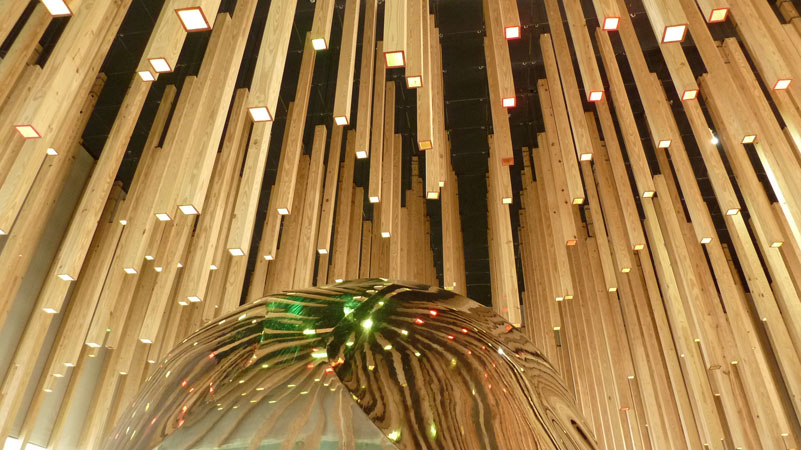
One of my personal favorites was Hungary’s display. It was unique from all the others because it chose to feature a rather geeky presentation. It didn’t go the high-tech route nor the historical or the artistic. Instead, it featured Hungary’s contribution to the world of mathematics – the Gomboc. Never heard of it? The textbook definition of the Gomboc is: a convex three-dimensional homogeneous body which, when resting on a flat surface, has just one stable and one unstable point of equilibrium.
In layman’s terms, its like the rolly-polly toy you used to play as a kid, the one you tried to knock down but it would always roll upright again. It had one center of equilibrium so it would always bounce upright on its own. But it kinda cheated the effect because the material wasn’t homogeneous since its base was rigged to be heavier than the top. A Gomboc is made of the same material all throughout, its the unique shape that makes it stand upright by itself.
This one is the biggest model in the world. Sadly, we weren’t allowed to rock the model to see it in action. But still, its kinda cool in a geeky sort of way and the presentation was top-notch. I give their presentation two-thumbs up for the sheer novelty.
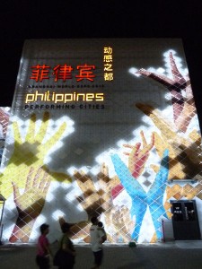
And last but not least, the Philippine Pavilion. Though I honestly hoped for the best, it sadly fell way below expectations. The lack of anyone actually lining up to see it bears silent testimony to the apathy and general lack of interest in what the Philippine Pavilion had to offer. I had to agree with a local journalist who called for our pavilion’s designers to be thrown into the Pasig river for such a dismal show of lackluster effort.
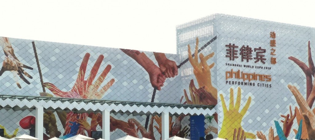
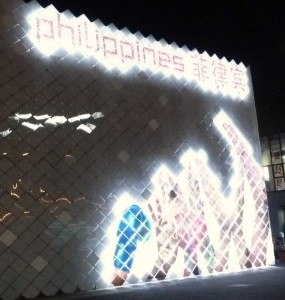
Philippine Pavilion: Performing Cities .To be fair, we shouldn’t be comparing our pavilion with those of other 1st-world countries who had bigger budgets to create their masterpieces. But it still pales in comparison beside other Asean countries like Vietnam, Indonesia, Malaysia, and Thailand (which incidentally rates as one of the consistent favorites among the pavilions in the SE Asian region). While our Asian neighbors put up quite a good show and was heavily promoting their tourism industry to millions of people attending the Expo, ours was just a plain generic boxy warehouse. No effort at all was expended in designing a unique architecture that would attract attention and capture the essence of what the Philippines is today (for better or for worse). Its only saving grace was a rather artistic mosaic tiled outer layer that lights up well at night.
At first we were puzzling over what the hands represented. Were they begging for alms? In light of the never-ending massacres and shoot-outs that always finds its way into our headlines, Was it a stop-sign gesture as in “Wag po kuya!” or “Don’t shoot!” ?
With special guest appearance of a certain un-named boxer .Notice the hands with boxing gloves in the mural. so that’s what the hands stand for – the Philippines is proud of its boxers, its “world-class” performers in the arts, and the “working hands” which most probably alludes to its OFW’s. Predictable… but honest. At least we didn’t try to project a totally irritating false image like some other countries did. We may be underachievers, but we’re not liars 🙂
Inside, you get a taste of down-to-earth Philippine living… perhaps a bit too down-to-earth… Perhaps the people who conceptualized the display didn’t quite grasp the notion of trying to impress visitors enough to actually want to visit our country. And with the recent tourism hit the country suffered, it really needs shock-and-awe tactics to upstage our Asean competitors in luring tourism dollars. I doubt anyone’s to be impressed by showcasing typical tiangge trinkets, ordering halo-halo in a faux carinderia and getting a 5-minute hilot massage.
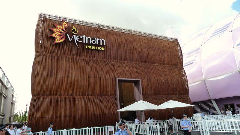
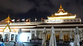
It’s really time to step up the game if we’re still trying to peddle our tourism industry to the rest of the world. Other Asian countries are already pulling out all the stops in their tourism marketing. Indonesia focused on its bio-diversity tour packages with a bit of ethnic cultural flavor, Malaysia went for the high-end resort angle, and Thailand totally impressed everyone with their cultural tours.
Malaysia Pavilion .Indonesia Pavilion .
Vietnam Pavilion .
Thailand Pavilion .If we don’t up the ante soon, its a sure bet we’ll be trailing behind other Asean neighbors who know how to properly market themselves. It’s not for the lack of talent as our pavilion’s theme does ring true… we really are quite rich in talent in the performing arts. It’s that we don’t know how to package ourselves well. Unlike Thailand which has got its tourism industry running like clockwork, we still have miles to go in terms of improving our basic tourist infrastructure and weeding out travel hazards like what has recently occurred in recent headlines. Only time will tell if we can still get back in the game.
If given the chance, how then would you have designed our Pavilion? What aspect of the Philippines would you have chosen to highlight to the rest of the world?
—-
For more information:
Visit the official website for a sneak peak of the 200+ pavilions on display:
http://en.expo2010.cn/pavilions/hqzg.htm#C
The World Expo 2010 in ongoing until October 31, 2010
For a detailed look at some of the unusual architecture and other artistic oddities, including the Hungarian GÖMBÖC:
http://www.archdaily.com/33339/hungarian-pavillion-for-shanghai-expo-2010/
—-
[All photos herein copyrighted by the author. Please permission from author prior to any sort of external usage]




Hey i just visited your site for the first time and i really liked it, i bookmarked it and will be back 😀
nice one! as the expo draws to a close…we are a few of the lucky ones who have experienced this glorious spectacle of chinas power…zhong guo jia you!